Uber has just ditched the dodgy design it introduced in 2016 and gone back to basics with its new logo. This whole exercise has been a monumental waste of time, effort and money that could have been avoided with proper brand asset management.
Below we re-visit our post from 2016 that highlighted the mistakes Uber were making at the time, and suggest how you can avoid them.

1. Look at identity in use, not in isolation
Uber has belatedly acknowledged that the 2016 logo change made the brand less visible and impactful. “The previous logo is being abandoned because consumers weren’t regularly connecting it with Uber,” reports one article (1).
This f*ck up could have been avoided if Uber had looked at the logo in use, rather than in isolation, as we posted on here. The company proudly presented the new logo in Vimeo videos and on a dedicated showcase website (ridiculous over-selling we’ll come back to later). But design should always be judged when in use.
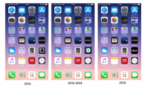
For consumer goods brands, this means looking at a new pack on a messy supermarket shelf, not on a perfect Powerpoint page. For Uber, it means seeing how the app icon works on a mobile phone home screen. Job 1 is to attract attention and be easy to find. Tap the Uber app, not the Trainline app, for example.
When seen this way, the 2016 logo looks less visible than the old one. The new 2018 logo is a bit better, but still not as good as the old ‘U’ one. This was confirmed by the response to the new design of Elodie and Chloé, my two 16 year old heavy Uber users. “The U was much better,” they complained.

2. Avoid fragmentation
Another 2016 screw-up that Uber has fixed is going back to a single logo, rather than totally different ones for “Riders” (i.e. customers) and Drivers. “Why is this necessary?” I posted on at the time. “I can’t think of a powerful global brand that fragments its identity by changing it based on target audience.”
Turns out that drivers didn’t like their new logo. “Some drivers turned the company-supplied decal inside out, since the name was on the flip side,” according to this report (1).
3. Treasure and measure your brand assets
Uber is one of a long line of companies that has leant the hard way about the risk of ditching ‘distinctive assets’, reversing a misguided change after negative in-market results. “We’re excited to unveil a new, simplified logo that is easily recognizable and brings back the U,” the company commented (1), even though I can’t see the U itself.
Distinctive assets (logos, colours, symbols, taglines etc.) should be treasured. They play a key role in building the ‘memory structure’ that helps your brand get recognised and recalled in today’s busy world. And it takes an estimated two to three years to build this memory structure.
However, brandgym research shows that most changes to brand assets are based on judgement, often prompted by organisational changes such as a new CMO or a take-over. This leads to companies like Uber, Mr Kipling and Keep Britain Tidy ditching distinctive assets because they fail to recognise their true value.
If you treasure your assets, measure them. We do this on projects using Iconic Asset Tracking (IcAT). Importantly, this uses an ‘implicit thinking’ approach, where people react to brand assets (colours, symbols, names etc.) in less than a second. This highlights the iconic assets that are embedded in memory structure, and would have probably shown Uber that the U device, black and white were all such assets.
4.Cut the bull**** and buzzwords
Distinctive assets do matter. And a new visual identity can be a symbol of change if it works as ‘sizzle’ to accompany product ‘sausage’ in the form of an upgraded customer experience.
However, Uber fell into the trap of spending too much time and energy on developing and then over-selling its logo change back in 2016.
Of particular concern was time CEO Travis Kalanick and his senior team wasted on, excuse the language, brand masturbation. “The team spent months researching architecture, textiles, scenery, art, fashion, people and more to come up with authentic identities for the countries where Uber operates,” Kalanick commented.
The announcement of the new logo was full of bull**** and buzzwords. “The new Uber brand system is made up of primary and secondary components that tell the story of technology moving the physical world,” explained a company spokesman with an accompanying animated visual depiction (below).

Kalanick and his senior team would of course been better off working on fixing Uber’s cultural and leadership issues. A year after the logo change nonsense Kalanick resigned, following multiple scandals about a corrosive corporate culture (2)
In conclusion, treasure and measure your assets to avoiding ditching distinctive brand properties like Uber. Focus on the product sausage, not just the emotional sizzle created by visual identity and communication. And please do join our campaign to cut through the bull**** and buzzwords of branding that we kicked off here with the very first brandgym blogpost back in 2006!
For more on the IcAT method to measure distinctive assets, see here.
References
(1)https://www.theverge.com/2018/9/12/17851248/uber-new-logo-font-app-design
(2)https://www.theguardian.com/technology/2017/jun/20/uber-ceo-travis-kalanick-resigns
