Post by Bety Martinez, Partner based in Mexico City.
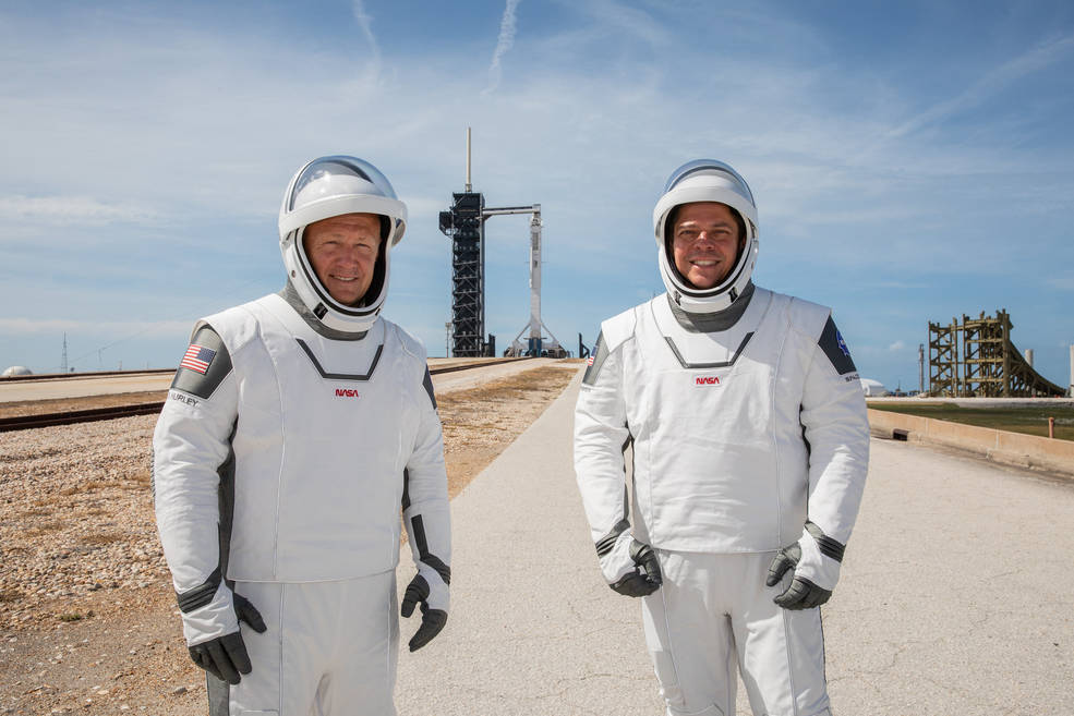
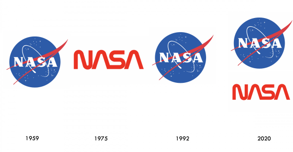
NASA successfully launched two astronauts to the International Space Station in SpaceX’s Falcon 9 capsule on May 30th. However, NASA have been much less successful with the more ‘down to earth’ task of managing logo changes. Back in the 1970s they radically changed their original ‘meatball’ logo to the more modern and stripped back ‘worm’ logo, only to then reverse this decision in 1992. And now in an even crazier move, NASA has started using both logos, continuing to employ the meatball as its primary symbol, but assessing how and where the worm will be used (1). This seems to be a recipe for confusion and brand erosion.
The NASA story is also a reminder that a brand should be about much more than a logo: it’s about driving the whole business. This is a key topic we address on our Mastering Brand Growth program, hosted on our brandgym Academy online training platform here.
In this post we look at some learning from NASA’s logo changes: launching, crashing and re-launching.
1. Avoid fragmentation
Done well, visual identity helps create consistency across the different touchpoints of a brand. This is especially important for a service brand, which has hundreds or even thousands of such touchpoints.
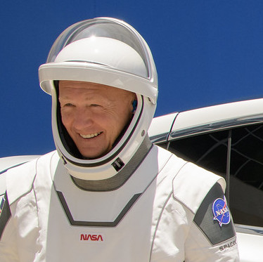
The NASA ‘double logo’ approach creates fragmentation, not consistency. You have the crazy case of the astronauts wearing a spacesuit with one logo on the arm, and another on the chest; looks like two brands, not one. We posted on a similar mis-move by Uber here, where they launched one logo for riders and a different one for drivers, only to come to their senses and change back to a single logo.
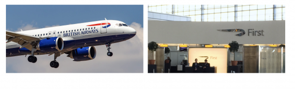
To note, smart design systems can create a single identity that can be ‘flexed’ across different touchpoints. British Airways uses the full logo on its planes and website, but just the visual ‘ribbon’ device in other places such as the First Check-in at Heathrow below.
2. Treasure and measure your brand assets
Distinctive assets (logos, colours, symbols, taglines etc.) should be treasured. They play a key role in building the ‘memory structure’ that helps your brand get recognised and recalled in today’s busy world. And it takes an estimated two to three years to build this memory structure.
However, brandgym research shows that most changes to valuable brand assets are based on judgement. This seems to have been the case with NASA over the years, where internal politics were apparently a key reason for the first change to the worm logo.
If you treasure your assets, measure them. We do this on projects using Iconic Asset Tracking (IcAT). Importantly, this uses an ‘implicit thinking’ approach, where people react to brand assets (colours, symbols, names etc.) in less than a second. This highlights the iconic assets that are embedded in memory structure.
If NASA had used this sort of approach, they might not have thrown away all the visual assets of the original identity back in the 70s: round shape representing a planet, stars representing space, red v-shaped wing representing aeronautics and circular orbit around the agency’s name representing space travel (2). And the announcement of the re-introduction of the worm by NASA’s boss suggests personal judgement is again at play rather than hard data. “I’m the first Administrator in history that wasn’t alive when we had people walking on the surface of the Moon….so my generation grew up with the Worm,” he said when explaining the rationale for the dual-logo approach (3).
3. Use visual identity to unite, not divide
Visual identity is like a flag or banner which should unite everyone inside an organisation. However, NASA seem to have a track record of doing just the opposite.
NASA’s chief historian Bill Barry explained the negative reaction to the dramatic ditching of the original logo for the worm in 1975 (4). “Only a few people at NASA knew anything about it. Many found out the old logo was being obliterated when new letterhead paper was shipped to them, with no further explanations,” he explained.
The change created internal controversy with people taking sides. Rather than aligning and engaging employees, it generated a loss in brand pride internally, which in turn can have a direct impact on other important factors such as employee loyalty, putting in extra effort and recommending the company to others.
4.Cut the bull**** and buzzwords
Distinctive assets do matter. And a new visual identity can be a symbol of change if it works as ‘sizzle’ to accompany product ‘sausage’ in the form of an upgraded customer experience.
However, NASA have fallen into the trap of spending too much time and energy over-selling its logo change. “The worm is back!” exclaimed Jim Bridenstine on Twitter, even adding a hashtag to express his excitement. “When the @SpaceX Falcon 9 lifts off, it will sport the iconic symbol #Thewormisback.” This sort of nonsense from NASA suggests they are spending too much time navel gazing.
In conclusion, I would recommend that NASA defines a single logo, and if they find they can’t compromise for one or the other, strategically develop a new one, starting by treasuring and measuring their existing assets. And NASA should use the change as a vehicle for recognition and inspiration, both internally and externally.
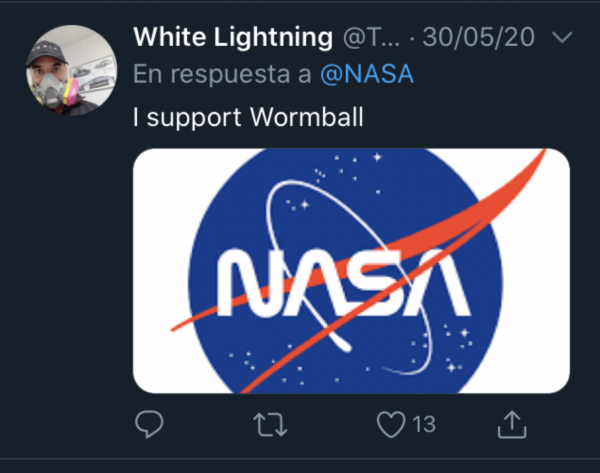
One option is to take inspiration from a suggestions on the organsiation’s Twitter account. A poll in which 25,176 people voted showed 62% preferring the orginal logo. Or, NASA could follow the suggestion of a ‘best of both’ approach christened the ‘wormball’!
To explore in much more depth what branding is really all about, check out our Mastering Brand Growth program, hosted on our brandgym Academy online training platform here. If you’d like more info on the program, simply pop your name and email in the form below (we’ll also send you the weekly brandgym blog email and brandgym Academy news, but you can opt out at any time).
Sources:
- https://arstechnica.com/science/2020/04/nasa-brings-its-iconic-worm-logo-back-to-mark-return-of-human-spaceflight/
- https://www.nasa.gov/audience/forstudents/5-8/features/symbols-of-nasa.html
- NASA Twitter account: Jim Bridestine on May 26, 2020
- https://edition.cnn.com/style/article/nasa-worm-logo-scn/index.html