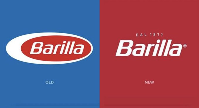
Distinctive brand assets such as logos, slogans and colours are valuable. So, any change should be carefully considered and managed. Barilla recently announced such a change with their new logo. And some observers feel that the brand has ditched distinctive brand assets in the process. “An example of a brand completely disregarding their legacy,” tweeted Insight Director Charlie Monzani (1). “I grew up with this brand, it is home, and the idea of it not having that white stripe and *that blue* is WRONG.” The image Charlie posted in her Tweet (see below) did indeed look like quite a radical change. The logo was no longer in a red oval housed inside a bigger white oval. And the background had changed from blue to red.
So, is this a smart move? Or has Barilla ditched some valuable and distinctive brand assets?
To help answer this question, we explore below how to “treasure, measure and manage” distinctive brand assets.

1. TREASURE your distinctive brand assets
Creating distinctive memory structure takes time. Estimates suggest two to three years of consistent marketing are needed to properly ‘encode’ a brand property. Visual identity, including logos and colours, is especially important for consumer goods brands like Barillia. Shoppers use these visual cues to make quick, ‘system 1’ decisions at the shelf, whether online or in a physical store. Radical changes to visual design can lead to a rapid drop in sales, such as the infamous Tropicana pack design change I posted on HERE.
The visual below from 1,000 Logos shows that Barilla’s logo change is not quite as radical as Charlie suggested (2). The red oval is still there. But the bigger, outer white oval HAS been removed. And this larger white oval has been used since 1936. So, Barilla IS walking away from over eight decades of ‘fresh consistency’ building and reinforcing this bit of memory structure.
There are also three other more subtle changes: i. the red is deeper in colour, ii. the typeface is slightly less rounded, especially on the ‘B’, ii. Dal 1877 has been added to cue the brand’s heritage.
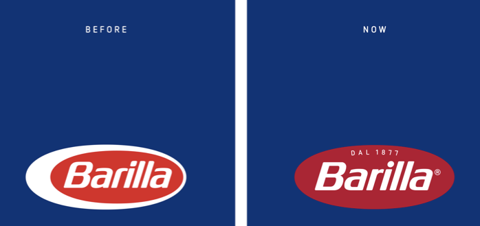
Note also that most of Barilla’s packaging is likely to continue with a blue background (see below). Again, this would make the logo change less radical than in the image at the start of the post.
2. MEASURE your distinctive brand assets
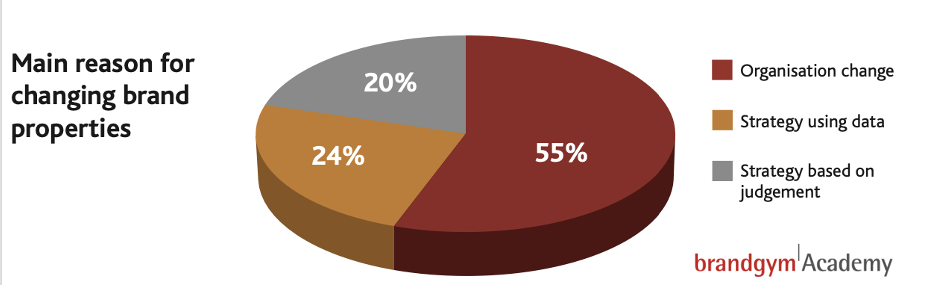
Decisions to ditch distinctive brand assets are often taken on judgement, not hard data, according to our brandgym research (below). Organisational moves, such as a new Marketing Director, are a common trigger for these changes. A mere 24% of brand property changes are based on quantitative data and this, I fear, is over-stated.
I’ve often heard Marketing Directors say, “I feel we should change our logo (or slogan or pack design).” Now, can you imagine a VP of Manufacturing saying, “I feel we should knock down our factory that’s been working well for years,” without supporting data? They’d be laughed out of the boardroom or even fired!
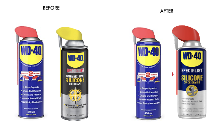
If you treasure your assets then you should measure them. On brandgym projects we use our ‘Iconic Asset Tracker’ (IcAT) to help brand owners make data-based decisions. Importantly, this uses an ‘implicit thinking’ approach. People react to brand properties in less than a second. This highlights the iconic assets that are truly embedded in memory structure. For example, on a brand architecture project for the WD-40 brand, the blue and yellow shield and red top were highlighted as key visual properties. This led to a re-design of the premium, professional grade Specialist line to better leverage these brand assets (see below). The change improved speed of on-shelf recognition for WD-40 Specialist, leading to positive sales results.
I wonder, did Barilla use such a quantitative study of their visual identity to inform the logo change? If they had, my hypothesis is that the red oval inside the white oval would have been a strong trigger for recognition. On the other hand, whilst red is important, I would expect the exact shade of red to be less critical. The darker red feels a bit more premium and is probably a good if subtle change.
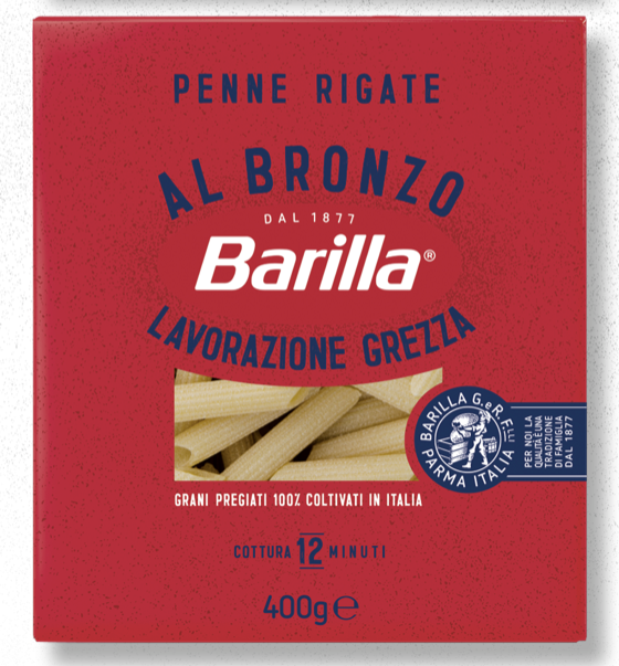
On the core ‘blue box’ pasta range, the loss of the white oval might be manageable. The blue background means the new red oval logo is likely to still ‘pop’. We’re hopefully not in Tropicana territory.
However, ditching the white oval looks more problematic on the new Al Bronzo line I read about on The Dieline (3). The new logo disappears in a sea of red and is likely to be much less impactful on shelf.
3. MANAGE your brand assets
Once you have treasured and measured your distinctive brand assets, you then need to manage them strategically.
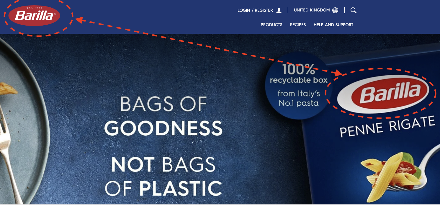
Any change to a brand asset needs to be carefully orchestrated to maximise the impact. I did find it slightly surprising that the new Barilla logo is being used on the brand’s website but not on the packaging. However, this disconnect may not be spotted by a normal person, as opposed to a ‘brandaholic’ like me!
Once a brand asset change has been made, I recommend putting in place a system of ongoing tracking, using a tool like the IcAT one mentioned earlier. The data from this type of study should then be used to guide any future changes. Remember, memory structure takes an estimated two to three years to establish! So frequent changes should be avoided.
In conclusion, the Barilla example shows the need to treasure, measure and manage your distinctive brand assets. The Barillia logo change is not quite as radical as it first seemed. Time will tell if the loss of the white outer oval causes a loss of on-shelf impact.
You can explore distinctive brand assets on our short, on-demand course on Growing the Core on our brandgym Academy platform here. The course is only £95+VAT and is fully refunded if you go on to take the full Mastering Brand Growth program.
SOURCES