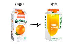
Tropicana’s disastrous design change in the USA is a sobering reminder for all of us about the risk you take when you change your pack. Especially when you change it for something which is, well, let’s say “sub-optimal” to be polite. I read about it in Mark Ritson’s column last week.
The change in question, made in January 2009, was not a cheap one. Tropicana paid design guru Peter Arnell a hefty sum for the new look which he claimed had been “engineered” to “imply ergonomically the notion of squeezing”. Huh? Here you can see the old (left) and new pack:

The new pack lasted only 7 weeks, before Pepsico pulled it, following complaints from disgruntled Tropican consumers, according to an article in The New York Times. Mark also points out that Tropicana’s sales this year have fallen 20%, down $33million (though there is no hard evidence that this is linked to the pack change).
So, what went wrong?
1. Throwing away valuable visual equities
Before any design change, there should be a rigorous process of identifying the key “visual equities” that help consumers identify the brand.
In Tropicana’s case, there are at least 2 key equities: i) the orange and straw visual, used for years and years in pack and communication, ii) the brand logo with the leaf on the “i”. And both of these were, amazingly, ditched. The result is a much more generic pack. As consumers rightly pointed out in complaint letters, the new packaging resembles ‘a generic
bargain brand’ or a ‘store brand’.
2. Impact is everything
Beyond the issue of the visual equities, it is mind-boggling that Pepsico accepted a pack with such dramatically poorer branding. The logo has been i) shrunk, ii) made less distinctive, iii) turned on its side.
3. If they can’t find you, you’re dead
A previous post talked about Andy Knowles’ point about how consumers make a “1 in 1000” choice for every item in their shopping basket (30 items in an average basket; 30,000 SKUs in a supermarket). And the only way they can do this is by shopping on auto-pilot, helped by the brands visual equities that have been “hard-wired” into their brains.
The result of Tropicana’s decreased branding and loss of visual equities was that people couldn’t find the brand easily enough. And that is really, really bad news. In a split second they reach for own label. And if they like what they buy, especially at a lower price, they may never come back.
Net, its not essential for loyal consumers to love a pack change. After all, they like what they buy and see no reason to change. However, the thing they must be able to do is to easily and confidently find the brand on shelf. Net, the best route for a strong and well established brand is to refresh and rejunevate that than re-invent the design.
A last thing I find appalling about the Tropicana story is the comment made by Mr Arnell, which shows what a bloody prima dona he is, lacking respect for the brand he worked on, and the brand’s consumers: ‘Can you imagine such mishegoss over a freaking box of juice? It’s not my brand [or] my company. So what the hell? I got paid a lot of money, and I have 30 other projects. You move on.’
Well, make sure he doesn’t move onto your brand if I were you…