
I’ve written before about the problem of brands “laddering” too high into the emotional stratosphere, losing all touch with the product. But the latest poster campaign from Expedia takes things to a whole new level. I spotted the poster last week at Putney train station (see below). And seven days later, I’m still scratching my head about this crazily cryptic communication. Below I suggest some steps to avoid making the same mistakes as Expedia.
1. Be clear, not cryptic!
Any communication campaign should of course be clear. But this is especially important with posters, that you tend to see when passing by on the move. They work best when they are direct and impactful, tapping into ‘system 1’ thinking.
The Expedia poster, however, is not clear at all. In fact it is absolutely bloody cryptic! It requires a lot of ‘system 2’, analytical thinking to try and figure out what the hell it’s about.
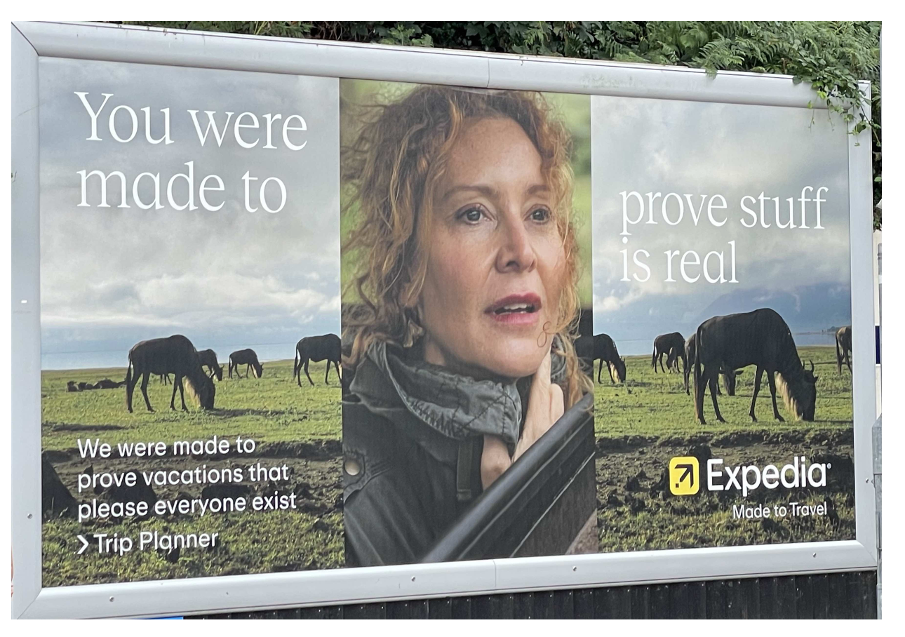
The key visual features a lady farmer and a field of cows with the headline: “You were made to prove stuff is real”:
-> I mean, WTF right? I still don’t really know what this means. The farmer was born to prove that her cows are real and not imaginary? Or that her cows will be turned into real meat, not a vegan meat substitute?
The body copy in small type then says: “We were made to prove that vacations that please everyone exist”:
-> Huh? This is a clumsy phrase. Combined with the small type size, it’s again hard to read. Also, the parallel with the farmer is far from obvious. She’s proving cows are real … whereas Expedia is proving that vacations pleasing everyone exist at all?
We then get a brief mention of: “Trip Planner”:
-> This hints at some sort of product feature. However, we have no idea what this is, what it does or what it has to do with proving that cows are real, not imaginary.
The fifth and final element is the tagline: “Expedia: Made to Travel”
-> We are at least back in the world of travel. But again, I’m clueless about what this really means. Doesn’t it sound like Expedia is the one travelling, rather than the brand’s users? Leaving this issue aside, there is a lack of distinctiveness. Isn’t any and every online travel platform made for travel?!
2. Focus on your brand and product
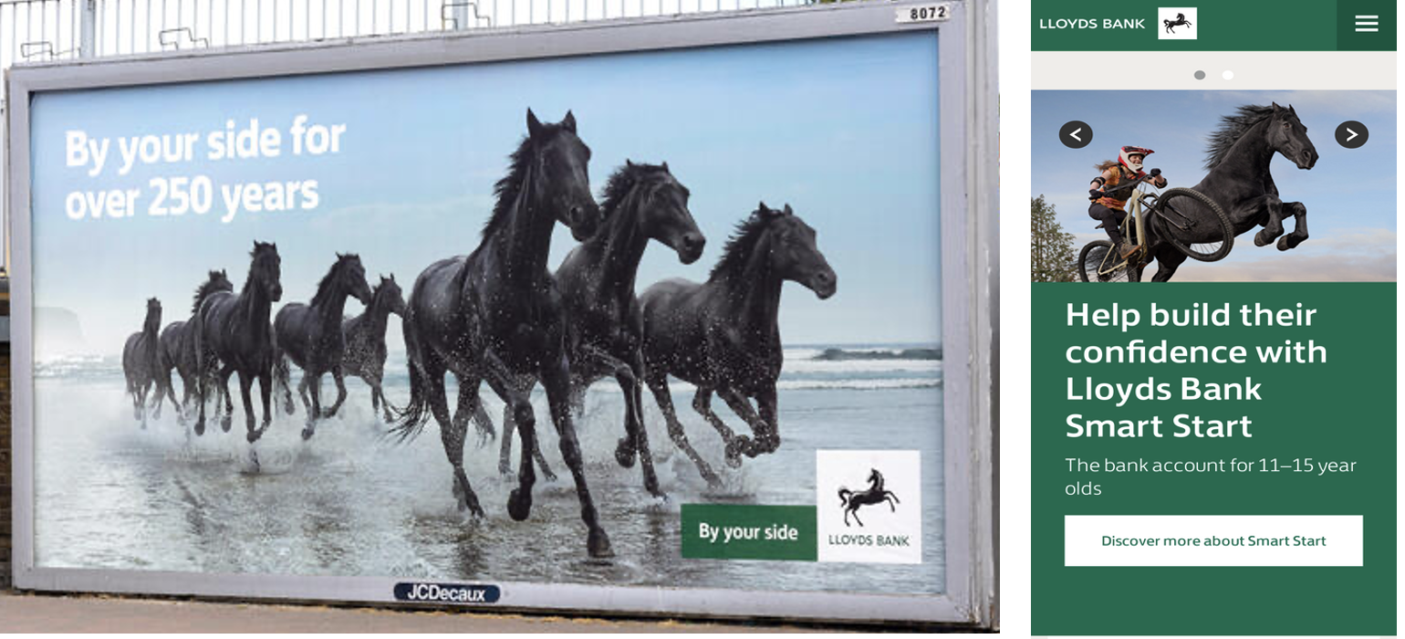
The Expedia campaign visuals and headline have absolutely bugger all to do with the brand, never mind the product. “You were made to prove stuff is real” and the visuals of farmland suggest an ad for a supermarket perhaps. Given the green colours, the gaze of the farmer and the animals, you could mistake the ad for Lloyd’s bank (more on that brand below).
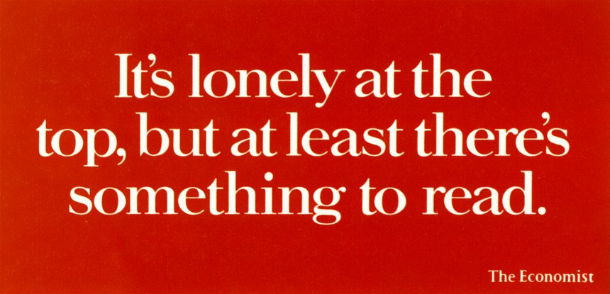
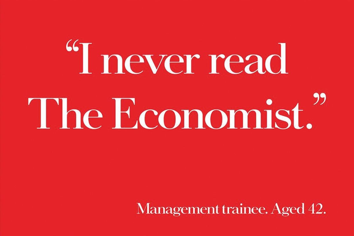
In contrast, the best posters strip everything back to a single visual concept that dramatises the brand idea. They stop you in your tracks and instantly communicate the product or service benefit. A great example is the epic, effective and long-running poster campaign for The Economist (see below). This campaign won a total of 66 creative awards including, most importantly, a silver in the IPA Effectiveness Awards.
3. Amplify distinctive brand assets
Great communication makes the brand and product the hero, combining functional “sausage” and emotional “sizzle”. It also builds on and amplifies distinctive brand assets to drive recognition, tapping into ‘system 1’ thinking. Here, the Expedia campaign also falls flat on its face unfortunately. Apart from the Expedia name and logo in the bottom right corner of the poster, I can’t see any visual brand assets being used.
Contrast this with the brand we posted on last week: Lloyds bank. As the post explained, Lloyds has built and amplified distinctive brand assets including the black horse and the campaign side, ‘By Your Side’. The brand poster campaign shows how to be single minded and visually impactful in dramatising the brand idea using these assets. These assets have then be leveraged to launch the Smart Start account for young people (below right).
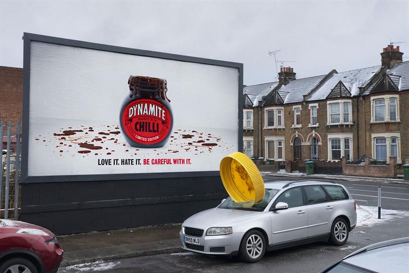
Marmite pushed the idea of amplifying brand assets a step further with the poster campaign for the Dynamite Chilli version. See below how the yellow top and distinctive jar shape were brought to life in explosive fashion!
In conclusion, Expedia’s crazily cryptic campaign shows how NOT to execute a poster ad. To avoid the same mistakes, focus on a single minded and impactful visual concept that dramatises the brand, leveraging your distinctive brand assets.