Post by David Nichols, Group Managing Partner and Head of Invention.
The latest ad for Kinder Surprise got me thinking about the magic in the mix of these little chocolate eggs with a toy inside. Kinder is not as big as the leading chocolate brands from Cadbury & Mars, but it is growing rapidly and profitably. “Ferrero profits jump 14 pct as Kinder eggs sales soar,’ reported Reuters here.
Below is our view on what they are doing right:
http://www.youtube.com/watch?v=P6xEKqGEi8U
- Build on a human truth: Yes, at first sight it’s chocolate with a toy. But the insight they work on is about “firing kids’ imaginations”. And this is a powerful insight that resonates strongly with parents, who are the purchasers, and also with kids who are the consumers.
- Be distinctive: The bright orange and white packaging is highly distinctive in a shelf dominated by rich purples, browns & blacks. The shape, name & concept has yet to be credibly copied by anyone at a matching price point. They have carved out a highly distinctive niche.
- Be “freshly consistent”: As you can see from the 1980s ad below, Kinder has remained relentlessly consistent in it’s proposition. In the latest execution they bring the same brand insight to life in a fresh and relevant contemporary way. Boring? Unimaginative? Neither. This consistency has created huge awareness, penetration and profit.
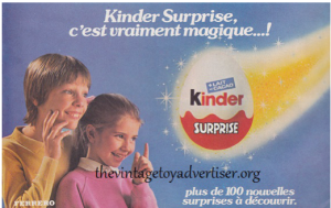
And zoom in on the visual identity. This has to be one of THE best examples of consistent and distinctive design we have ever seen. The Kinder logo, the white top, and red bottom with the wavy line are all there, 30 years later.

Even though you could argue that this new ad won’t win any creative awards in Canes, we are prepared to bet it connects with it’s intended target and communicates the benefit clearly and distinctively.