I thought I had seen it all when it comes to name change nonsense, with abrdn a recent example I posted on. But then my dad brought to my attention the ‘re-branding’ of Hermes, one of the one of UK’s worst parcel delivery services. The company and their design agency Supeunion revealed with a fanfare the new name, Evri, along with a new visual identity.
1. MISTAKING A LOGO FOR A BRAND (AGAIN)
I hang my head in despair to read about yet another company and their agency mistakenly presenting a logo change as a new brand. “They acknowledged the need for a ground-breaking brand to clearly set out their mission,” Superunion UK CEO Holly Maguire stated (1)
This is extremely unhelpful as it propagates the idea that branding is just about names and logos, rather than a strategy to drive the business as a whole.
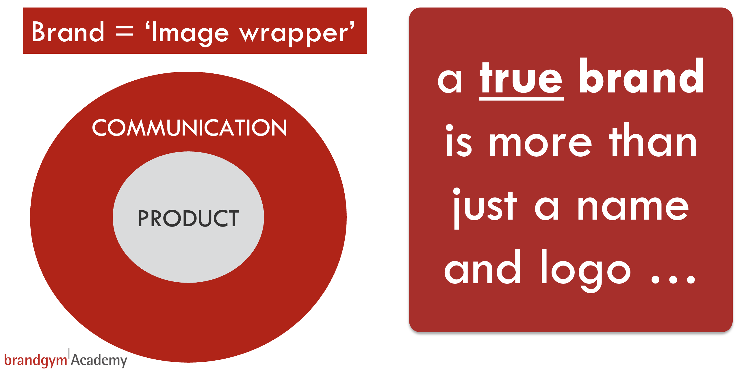
2. ‘IMAGE WRAPPER BRANDING’
The Evri name change is perhaps the worst ever example of ‘image wrapper branding’ I’ve seen. Here, the outside name and logo changes to try and add some emotional ‘sizzle’. But the product ‘sausage’ inside stays the broadly the same. And boy oh boy, what a dodgy sausage it is! Hermes came last in a Citizens Advice league table of delivery firms in November 2021, with an overall rating of 1.5 stars. The company got a 2-star rating for ‘trust’ and a 1-star rating for customer problem handling (2).
An undercover Times reporter worked for Hermes for a month and reported a catalogue of service nightmares. “Managers watched as workers threw parcels across a depot to save time while sorting them,” the reporter explained. “One manager admitted that in the chaotic run-up to Christmas shoppers were paying for next-day deliveries with no chance of these being fulfilled. Couriers were encouraged to mislead customers and ‘act stupid’ if faced with complaints.” (3)
And what did the Hermes management do to respond to these negative reports? Acknowledge the problems and put in place a strategy and plan to fix the issues? No. Hermes said the findings by the Times were “unfounded and do not reflect our business” and described the research by Citizens’ Advice as “flawed” (2). Instead, the company’s leadership team invested time and money in a name and logo change.
3. WASTING TIME and MONEY
When I read the details of the new logo system I had to check it wasn’t April 1st. Buckle up as I try to explain it…
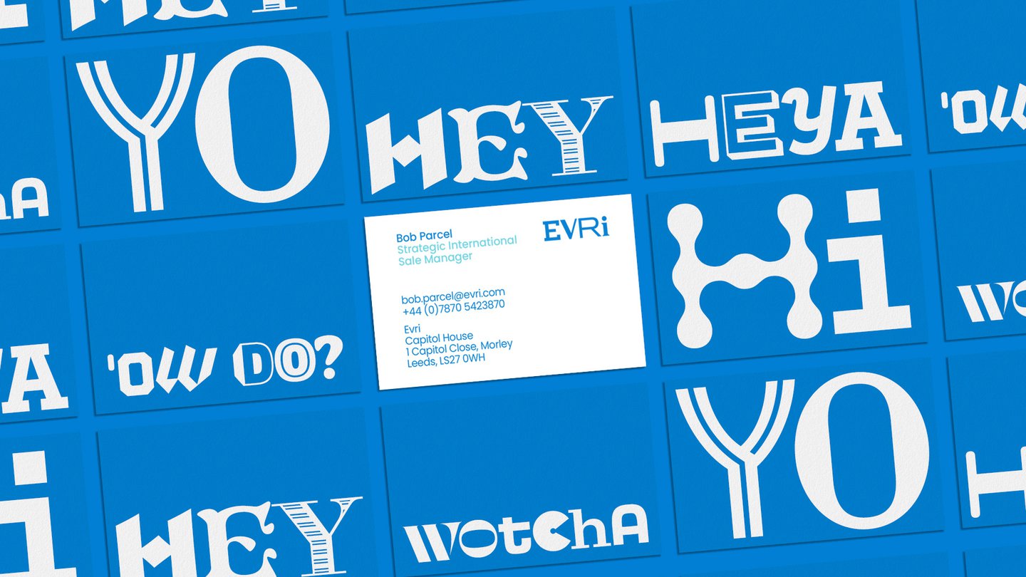
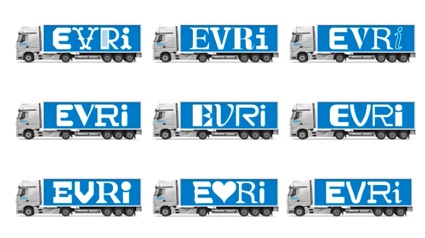
Superunion and partner agency Monotype have created, I kid you not, a “chamaleonic logo” that uses “variable font intelligence,” according to a Design Week article (4). A tool built into the typeface (see below) makes it easy for Evri’s teams to “randomnise the fonts of each letter in the logo for different uses – resulting in 194,481 different possible logo iterations.” I know. WTF.

And the benefit of this sophisticated system? “Each default character can appear stylistically unique across Evri’s communications,” the article explains. “Each delivery van in the 5,000-strong fleet can have its own design, creating a piece of vinyl artwork for each truck.”
The first flaw in this logic us that you will be hard pressed to spot the difference between the logo iterations (look closely at the image below you might be able to spot the different logos on the different lorries). But more importantly, who on earth cares about this? The answer is, I propose, no-one who lives in the real world rather than a design studio!
4. CONSUMERS DON’T CARE
The justification for the new name and logo is that it “emphasises the diversity and multiplicity of the UK and its communities.” (4) But is this idea really relevant for consumers? I don’t think so. With parcel delivery I suggest the key need is to have as little ‘friction’ as possible, a topic I posted on here. People want something that is smooth, efficient and no-hassle.
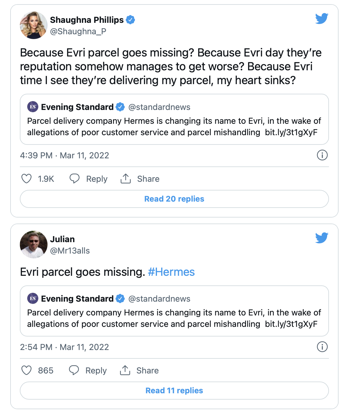
Consumers who have suffered from Hermes’ dodgy delivery service took to social media in their thousands to vent their fury and mercilessly mock the new name (5).
B2B branding is also key for Hermes/Evri, with retailers like Amazon using it as one of its fulfilment partners. And I seriously doubt that a customer like Amazon cares that Evri now has 5,000 vans each with its own logo. Rather, they want to see their stuff being delivered properly and on time, to avoid bad service reflecting negatively on them.
5. LACK OF ACTION
Visual identity and name changes can be effective when they are symbol of real, tangible and positive change. Ideally, the improvement in service delivery should happen at the same time or even before the evolution of the visual identity.
In the case of Evri, CEO Martijn de Lange claims that Evri is more than a name change. But we are yet to see the actions that back this up. It seems to be a case of name change today, improved service tomorrow (maybe). “This is … a statement of intent of our commitment to leading the way in creating responsible delivery experiences for ‘Evri one’, ‘Evri where’,” de Lange proclaimed. “It heralds a new culture and an even better way of doing things.” (6)
Digging deeper, it does seem there are some future plans, including a new UK-based customer service team, 200 experts based in local depots and auto-enrolment in a pension scheme for all 20,000 workers (7). Time will tell if the Evri does brand AND deliver.
In conclusion, Evri is unfortunately another example of image wrapper branding, where a new name and logo is used to try and cover up shortcomings in the underlying product. And to make things worse, time and money has been wasted on a visual identity system that create complexity rather than consumer relevance.
The Evri logo system reminds me the new Uber design I posted on back in 2016. Uber created different visual identities for different countries. “The team spent months researching architecture, textiles, scenery, art, fashion, people and more to come up with authentic identities for the countries where Uber operates,” explained CEO Travis Kalanick at the time. This nonsense lasted for two years before and Uber reversed the change and went back a simple, single-minded visual identity, as I posted on here. Watch this space to see if the Evri brand leadership team make the same sort of change in a couple of years time ….
SOURCES