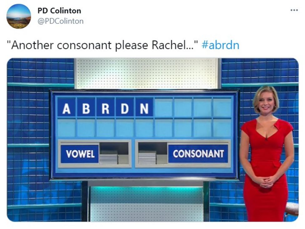
I thought I’d seen it all when it comes to name change nonsense. But no. The re-naming of Standard Life Aberdeen as abrdn has taken things to a whole new level. Or, should I say, plumbed new depths. And no, the spelling of the new name is not a typo. It actually is abdrn. No, really.

Now CEO Stephen Bird is right when he says that efficiency can come from replacing five different brand names with a single name (1). Standard Life Aberdeen was created by the merger of Standard Life and Aberdeen Asset Management in 2017. The firm had six brands and websites, down to five after the recent sale of the Standard Life brand.
Full marks for portfolio strategy thinking, a topic we covered in a previous post here.
The issue is the name and visual identity Stephen and the senior team have chosen, created by Wolf Ollins.

1.Mistaking a logo for a brand (again)
You have to hang you head in despair to read yet another company mistakenly presenting a logo change as a new “brand”.
“I hate the CEO saying we’ve introduced a differentiated brand for a start; no you haven’t, you’ve adopted a potentially stand out name,” rightly ranted Stephen Cheliotis on Linked In. “This alone, neatly surmises the issue of the C-suite not getting the basics when its comes to brands.”
You can stream for free here a module on brand-led business our from Mastering Brand Growth program that explores this problem in more detail.
2.The name is bloody unpronounceable !
The first and most important criteria for a successful brand name change is that the new name is easy to remember and pronounce. This is critical to help create the distinctive memory structure needed to recall a brand at the moment of truth when customers decide what to buy.
The biggest and glaringly obvious issue with the name abrdn is that it is bloody impossible to pronounce. I assumed it was “abreden” when I first saw it.
“Investors need simple fund names that are recognisable amongst the thousands of investments out there,” rightly points out Laith Khalaf, financial analyst at AJ Bell (1). As Laith goes onto say, I assume whilst struggling to keep a straight face, “Having a brand name you can actually say is a big help.”
3.Valuable time will be wasted explaining the name
Laith Khalaf also points out that the need to explain how to pronounce the name change will “not be lost on financial advisers up and down the country” (2).
Did no-one raise a red flag when they read the press release that actually includes an explanation on how to say the name?! “The new Abrdn name (pronounced ‘Aberdeen’)” (3)
Imagine being a financial adviser deciding which funds you should recommend to a client. Even if abrdn has some good funds, would you want to waste valuable time trying to explain the name? The name is doing the exact opposite of what a brand is supposed to do: help people choose easily and confidently.
4.The new logo: ”Dad dancing at a disco”?
Warning signs started flashing when I read that the Standard Life Aberdeen “re-branding” (re-naming!) has “the aim of creating a modern, agile, digitally-enabled brand.” (3)
The result is, to my eyes, a logo that looks like it is trying a little too hard to be up to date… like “a dad dancing at the disco” is how I describe this! All the elements of a trendy brand are there. Lower case, sans serif typeface: tick. Pixelated dots to show we’re digital: tick. Name with vowels missing like pop stars The Weeknd and Juice WRLD: tick.
But in financial services, a key need is also to communicate reliable performance. Here, Standard Life Aberdeen actually have a decent product ‘sausage’ to build on: 71% of the company’s funds beat their 1 year benchmark, according to Stephen Bird (4). And yet reliability and performance don’t come across strongly in the new logo, I suggest.
5.”Throwing the baby away with the brand name bathwater”
There is a need for freshness when updating a brand’s visual identity. But there is also a need for consistency, to build on the established memory structure.
However, in the case of Standard Life Aberdeen, there has been no attempt to build on any of the elements of the previous visual identity (see below). Rather than refreshing the visual identity, the team have gone for a radical re-design.
In conclusion, abdrn is, I’m sorry to say, yet another example of name change nonsense that gets branding a bad reputation.
My bet is that the name will be changed within three years. If it is still in use in April 2024, I will offer a free brand strategy coaching to the abdrn CEO at the time, over dinner in a restaurant of his or her choice!
To learn more about how to use brand as a catalyst for growth across the whole business, you can join our next Mastering Brand Growth program here.
SOURCES
(1) https://www.cityam.com/standard-life-aberdeen-to-change-name-to-abrdn
(2) https://www.bbc.co.uk/news/business-56888611
(3) https://www.standardlifeaberdeen.com/en/sla-to-become-abrdn
