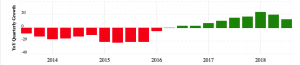
The renaming of Weight Watchers’ to ‘WW’ shows the risks of changing brand name. The company lost 300,000 subscribers in the quarter following the September 2018 change, followed by a disappointing post-festive peak season at the start of 2019. CEO Mindy Grossman forecast full year results well below expectations, with earnings per share of $1.25 to $1.50 less than half what was predicted (1). The share price dropped 36%, and is now back down close to historical levels after having enjoyed stellar growth in the last couple of years.
Never mind WW. My question is WTF?

1. REFRESHING what made you famous
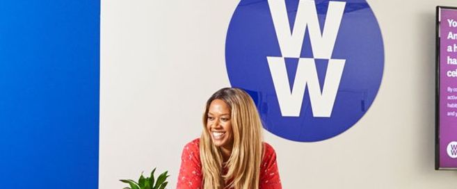
Until last year, Weight Watchers was a great example of brand rejuvenation, driven by the genius move to get Oprah Winfrey to buy 10% of the company in 2015. By becoming the public face of the brand, she not only boosted brand awareness, she also added credibility to the weight loss promise. “If she’s bought 10% of the company, their programs must work!” was the desired response.

The brand also renewed its product offer, including the Freestyle program expanded the list of ‘zero points’ foods, giving more freedom of choice of what to eat.
All the above followed a move to refresh the brand’s visual identity in 2012 to make it fresher and more contemporary, including a shorthand WW version of the logo.

After years of decline, revenues grew for several quarters in a row.
So, what went wrong? How has Weight Watchers seemed to clutch defeat from the jaws of victory?
2. FORGETTING what made you famous
I suggest the first and most fundamental mistake made by Weight Watchers was forgetting what made it famous , by shifting focus from weight loss to a broader remit of ‘health and wellness’. The move was reflected in the new slogan, Wellness That Works.
This change suggests the company believes weight loss is becoming less relevant over time, and health and wellness more so. But is that the case?
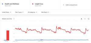
A quick look at Google Trends in the US suggests that the answer is “no” (see below).
First, the search term ‘weight loss’ (red) is 20 times more popular than ‘health and wellness’ (blue). Second, the level of interest in weight loss is stable over the last 5 years and remarkably consistent. Searches peak straight after the Christmas festive season, stay high up to the summer holdidays in July, then drop off in the winter months.
Even the CEO agrees that Weight Watchers has forgotten what made it famous, and what is relevant, as shown in her comments about the brand’s poorly performing peak season marketing campaign. “I think it needed to be more weight-loss focused, especially in the January season.”
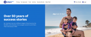
Indeed, despite the name change and the claim that the brand has moved focus to wellness, the focus of communication still seems to put weight loss front and centre. The success story below from the website doesn’t say, “Jay got 20% more well”, it says “Jay lost 21lbs”.
3. Making it harder to choose
The more basic but costly mistake was to make the brand’s name more complicated to use.
‘WW’ is a mouthful to pronounce and has four syllables, in contrast to ‘Weight Watchers’ which rolls off the tongue and has three syllables.
To make things worse, the CEO even refused to give some meaning to the new name. She said that the letters did not stand for Weight Watchers, nor for the ‘Wellness that Works’ slogan, but were simply “a marque”.
4. Change name only if you really have to
The only reason to change your brand name is when the name is genuinely holding back business growth. For example, Park at My House started out doing what the name suggests: renting parking places on peoples’ driveways. However, as the company grew, it started offering parking in lots of places including company car parks, churches, schools and hotels. The new name, Just Park, better communicated the breadth of offer, as I posted on here.
Weight Watchers was a different case, as the company had successfully re-launched in 2015, was growing nicely and offered a benefit that was still highly relevant.
In addition, Just Park is a shorter, snappier name with two syllables versus two, in contrast to the wordier mouthful that is WW.
5. The way forward: ‘fresh consistency’
Mindy Grossman was spot on when she said, “Like any brand we have to stay relevant.” (2) Every brand needs to keep refreshing itself to keep up to date. However, brands also need consistency, to build on and reinforce the distinctive memory structures that made them successful in the first place, as was this case in brand rejuvenation projects for Carling Black Label and Standard Bank, for example.
In the case of Weight Watchers, I suggest the brand got the balance wrong: too much freshness, and not enough consistency. And to make things worse, it picked a silly name that is harder to pronounce that the old one.
The brand could have continued with its rejuvenation program, including making weight loss part of a more holistic approach to healthy living, and used the WW symbol as its logo, without changing its name.
In conclusion, Weight Watchers is another in an unfortunately long line of visual identity changes that hurt rather than helped the brand and business.
I’ll watch with interest to see if the company follows the well-trodden path of reversing the change, as was the case with Uber, Keep Britain Tidy and Yell.
SOURCES
1. https://markets.businessinsider.com/news/stocks/weight-watchers-earnings-q4-2019-2-1027986470
2. https://www.bbc.co.uk/news/business-45625191