Managing distinctive brand assets (slogans, colours, logos etc.) requires a careful balance of freshness on the one hand and consistency on the other. British cake brand Mr Kipling suffered from too much freshness, chopping and changing every year. Back in 2018, I suggested that the brand had finally focused on remembering and refreshing what made it famous, led by Premier Foods marketing director Helen Warren-Piper. The brand came up again in discussions on a private Mastering Brand Growth Program that finished yesterday. So, I decided to keep the following commitment made in that 2018 post:
“We’ll meet back here in four to five years time to see if Helen and the Mr Kipling team stuck to to the advice this time!”
1. 2014 – Ditching distinctive brand assets
Communiction
I first wrote about Mr Kipling way back in 2014.“Is Mr Kipling mad to ditch a 46 year old slogan?” I asked. This was prompted by plans to ditch a distinctive asset: the long-standing communication campaign with the famous slogan ‘Mr Kipling makes Exceedingly good cakes’. When the new campaign came out a few months later, the famous slogan did briefly appear at the end. But the focus was on a new idea: ‘Life is Better With Cake’.
I suggested that the campaign was too focused on emotional “sizzle”. A young boy danced with an imaginary pink elephant for most of the ad, deciding at the end to share his Mr Kipling cake with his new friend. The brand lacked a central, heroic role: it was not the effective way of achieving a goal. The boy and the elephant are already having fun, and the Mr Kipling cake plays a minor role; life was already great before the cake. The result is what we I call “sponsored entertainment”: a charming, entertaining ad with the brand’s logo slapped at the end.
Pack design
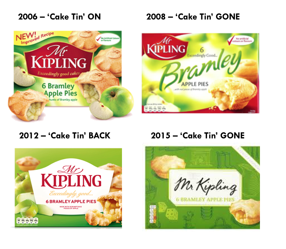
But it wasn’t just in advertising where the brand was ditching distinctive assets. Indeed, even worse was brand mis-mismanagement of distinctive design assets, as shown below. Helen Warren-Piper recognised the risks of this approach. “You play with those things (distinctive assets) at your peril,” she told Marketing Week (2).
- 2006: the brand’s distinctive ‘cake tin’ asset was bang in the middle of the pack
- 2008 = Chop: the distinctive asset was messed with and moved to the top left corner. A generic product descriptor took centre stage.
- 2012 = Change: helped by the distinctive asset experts at agency JKR, the cake tin took centre stage again
- 2015 = Chop: with a new design agency, Brand Opus, the distinctive asset was ditched yet again (bottom right). “The old cake-shaped lozenge has been transformed into a ‘calling card’ to convey the idea that Mr Kipling has personally approved each box of cakes,” suggested an article (3). Uh oh.

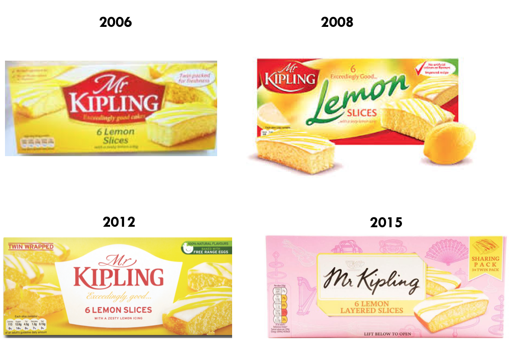
The brand also ditched another distinctive design asset in the 2015 changes: the yellow colour of Mr Kipling’s Lemon Slices. This was a risky move, as shoppers use colours to navigate and find what they want using ‘system 1’ thinking. After years of being yellow, a pink design was introduced in a scheme based on consumer need states. This “theoretical approach that failed to take into account that customers associate Lemon Slices with yellow packaging, not pink,” right reported Marketing Week (2). The clue was of course in the bloody product name: LEMON Slices!

2. 2018 – Re-Discovering distinctive brand assets
By 2018, the Mr Kipling brand was suffering. Sales of sweet treats at brand owner Premier Foods fell 4.3% in the nine months prior to the post (1). Under Helen’s leadership, Premier Foods finally re-focused on remembering and refreshing the brand’s distinctive assets.
Pack design
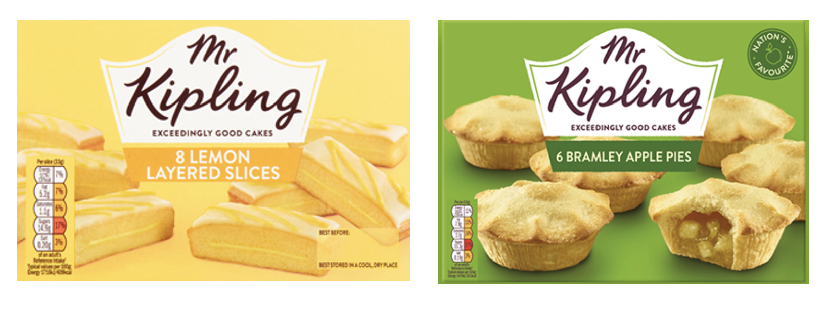
The team “looked back at all previous pack designs,”she explained Helen. “The cake tin lock-up device had been replaced with a calling card. We felt it right to bring that back.” The new design is below. The lower case type for the logo was a nice touch, making it look more like Mr Kipling’s signature. And Lemon Slices are, well, lemon again.

Communication
The team also re-discovered and refreshed the brand’s distinctive communication assets. “We’ve gone back to the product truth and really moved that forward,” commented Helen, music to my ears as a believer in the enduring importance of product “sausage”. Mr Kipling was back at the end telling us about his “Exceedingly good cakes”. The new campaign aimed to connect emotionally with the viewer. But in contrast with the boy and the elephant from 2014, Mr Kipling now had a key role in helping the main character achieve a goal. In ‘The Piano Thief,” the young boy wants to get his hands on an Mr Kipling cake as a treat for his older sister, who is studying for her exams.
3. 2023 – Driving distinctive brand assets
So, what has happened in the five years since the last blog post? I’m pleased to day that the brand has not chopped and changed its distinctive brand assets. Phew! Getting a better balance of freshness and consistency seems to be paying off. Sales of the brand hit £150million for the first time in 2020/21, helping drive growth of 4.7% on the cakes business (5). Sweet treat sales were also up up +2.7% in the latest financial year results, reported in May (6).
The pack design seems to have stayed exactly the same, looking at the brand’s website.
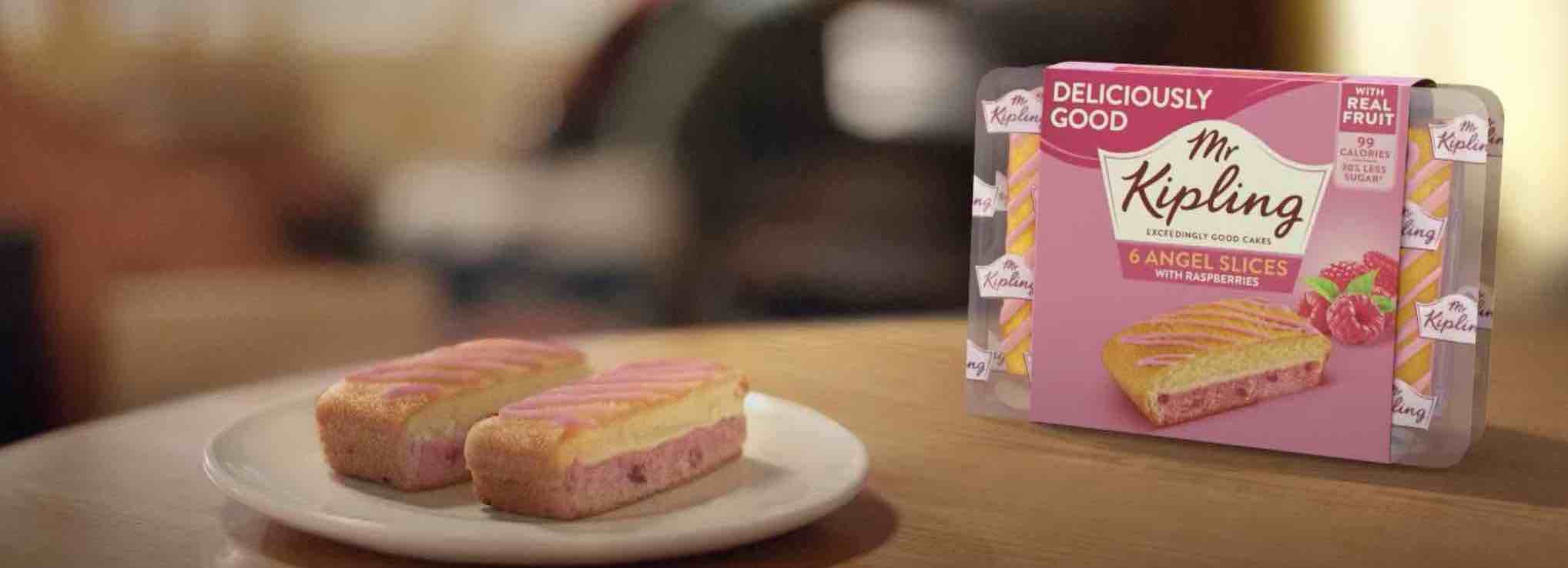
What about communication? The brand recently launched its first new campaign since the 2018 ad mentioned above. “‘The Piano’ captures a nostalgic moment between a daughter and her grey-haired dad with an Angel Slice and a cup of tea,” explains one news report (4).
Working well
It is good to see the distinctive brand asset of the slogan “Mr Kipling makes Exceedingly good cakes.” And the focus is rightly on driving brand awareness. “We want to reinforce the brand’s position in the market and keep it top of mind for consumers,” commented Premier Foods current CMO, Yilmaz Erceyes. The communication also taps into a cultural truth. “Over the past two years, people all over the world realised they took the seemingly small things for granted,” explained Yilmaz. “Our advert was created to resonate with those who missed spending time with friends and family in recent years”. I do think a trick was missed by not featuring the slogan in written form at the end to amplify the voice over. Though featuring the pack people need to look for, not just the product, is a smart move.
The communication is way, way better than the dancing elephant of before. It is beautifully shot, capturing an emotional moment very well. The product does appear at the start of the ad, with the daughter taking quick bite. And having the dad & daughter duet feature a 1990’s classic (“All the small things” by Blink 182), clever cues nostalgia in a positive way. “It felt like the perfect song for Mr Kipling – an old favourite that’s as good today as it ever was,” revealed Elliot Lee & Rory Peyton-Jones, the creatives at McCann London behind the campaign. It does also have fresh consistency in a sonic sense, with piano playing featuring again, though I’m not sure if this was intentional!
Questions
My question is on the brand’s role, which does seem less central than in the ‘Piano thief’ ad from 2018. Looking at the communication concept explains why this has happened. ‘It’s the Little things that sometimes mean the most’ doesn’t give a clear role to the Mr Kipling brand. So, the little thing that takes a starring role is the piano duet between dad and daughter. Poor old dad doesn’t even get to enjoy any Mr Kipling cake! The product has a supporting role in the background, rather than being a catalyst for the connection.
That said, Yilmaz does report positive pre-testing results. So, let’s see what happens in market!
In conclusion, the Mr Kipling brand story shows the importance of remembering and refreshing your distinctive brand assets and ensuring your brand plays a starring, not supporting, role in your marketing. It is great to see how with the right leadership a brand can get back on track.
Sources:
(1) https://www.premierfoods.co.uk/getattachment/media/news-releases/Items/We-announce-our-Q3-2017-18-Trading-update/Premier-Foods-2017_18-Q3-Trading-Statement-16-January-2018-Final.pdf.aspx
(4) https://www.lbbonline.com/news/mr-kiplings-angel-slices-spark-a-sweet-moment-in-new-ad
(5) https://bakeryinfo.co.uk/finance/mr-kipling-sales-hit-150m-for-first-time-ever/656236.article
(6) https://www.premierfoods.co.uk/Media/Latest-News-Stories/News-2023/Preliminary-results-for-Premier-Foods-for-the-52-w.aspx
