


Too much brand sponsorship is still stuck in “logo land”. Buy the rights, slap your logo on the event, add a few social posts and hope some of the partner’s fame rubs off. But the best partnerships work harder than this. They don’t just use sponsorship for visibility. They use it to create brand integration, where the partner’s distinctive assets are baked into your product, service or experience. The Stella Artois x Wimbledon limited edition can is a lovely example.
Rather than simply badging a standard can with the Wimbledon logo, Stella has created a special pack that feels genuinely inspired by the tournament. It uses Wimbledon’s famous white dress code, purple and green colour palette and tennis language to create something distinctive, elegant and fun.
Here are three key insights for anyone working on a sponsorship initiative.

1. Don’t just slap on the sponsor’s logo
The lazy version of this idea would have been easy. Take a regular Stella Artois can. Add the Wimbledon logo. Maybe add “Official Partner”. Job done.
But that would have been sponsorship as badging, not brand building.
Stella has gone further by creating a limited edition can that is specific to the partnership. The can itself becomes a piece of Wimbledon communication. It is not just carrying the sponsorship. It is dramatizing it.
This matters because brand partnerships should ideally create something people can notice, remember and talk about. A sponsor logo on a standard pack may deliver visibility, but it rarely creates much mental availability. A distinctive limited edition can has a better chance of doing this, especially when the execution is sharp enough to earn attention in social and at point of purchase.
2. Bake in the partner brand
The best sponsorships feel baked in, not stuck on.
In this case, Stella has baked Wimbledon into the actual design of the can. The most obvious move is the almost entirely white pack, linking directly to Wimbledon’s famous clothing rules. This is a clever way to connect the product to one of the tournament’s most distinctive codes.
Then comes the single trim of colour around the top of the can, using Wimbledon’s purple and green. This is a small detail, but an important one. It brings in the partner brand’s visual assets without overwhelming Stella’s own identity.
The result is a nice bit of fresh consistency. Stella is still recognisable: the Artois name, the crest and the premium beer cues are all there. But the brand has been refreshed through the world of Wimbledon.
3. Execute with excellence
The strongest part of the launch is not just the can. It is how the can was introduced.
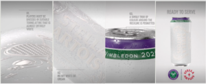
Stella uses a funny take on Wimbledon’s clothing rules to reveal the pack in stages. The sequence works beautifully because it starts in the world of tennis, then lands on the product:
01. Players must be dressed in suitable tennis attire that is almost entirely white
02. No off white or cream
03. A single trim of colour around the neckline is permitted
Then comes the can: almost entirely white, with a single purple and green trim around the top.
The final line is also a smart double-take on beer and tennis: “Ready to Serve.”
This is a lovely example of brand storytelling. The design is not simply shown; it is explained in a way that is witty, visual and rooted in Wimbledon.
4. Use premium “brand body language”
The Stella x Wimbledon can is a great example of how to cue premiumness using what we call “brand body language”: how a brand acts and feels, not just what but says. The white-on-white embossed Stella design looks elegant. The water droplets add cold refreshment. The purple and green trim gives just enough Wimbledon recognition. And the whole thing avoids the trap of becoming a noisy souvenir can.
5. Adapt the message to the medium
A strong brand idea should travel across channels. But it shouldn’t simply be copied and pasted. Stella show how to adapt the message to fit the medium.
The images shared earlier come from an Instagram reel. Here, viewers can pause and take a few seconds to watch the story unfold in stages and get rewarded with the can reveal.
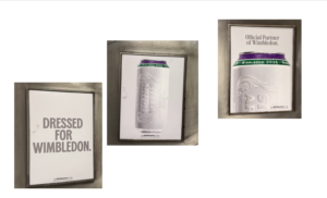
The London Underground posters I saw today do a different job. Seen heading up or down on an escalator, tube travellers have only a few seconds to take in the message. So the idea is stripped back to a sharper, simpler line: “Dressed for Wimbledon.” This idea quickly links the white can to Wimbledon’s dress code. The pack shot and “Official Partner of Wimbledon” line then do the rest.
This is a useful reminder for brand teams. Fresh consistency does not mean repeating the same execution everywhere. It means having one clear idea, then adapting it creatively.
In conclusion
In conclusion, Stella Artois’ limited edition Wimbledon can shows how to turn sponsorship into brand integration: don’t just slap on a sponsor logo, bake your partner’s distinctive assets into your product and execute the idea with real craft.
