


Distinctive brand assets are now firmly on the brand-building agenda. Most marketers know that assets such as colours, shapes, icons, characters and logos can help build mental availability, making a brand easier to recognise, remember and buy.
However, much of the work on assets stops at the brand asset scores on measures such as brand linkage and recognition. A useful additional question to ask is: what is really driving distinctiveness? Is it the colour? The shape? The label? The character?
In this post, we share insights from a research methodology used by brandgym partner agency Distinctive BAT (1) to help identify the real drivers of distinctiveness. This allows teams to make better informed decisions on packaging, advertising, brand architecture and range navigation.
1. Identify the driver hierarchy
Many packs are made up of several visual assets: colour, shape, label, cap, typography, logo and icon. The key is to understand which of these actually drive recognition and how they work together.
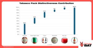
Tabasco is a great example. The brand has five main packaging variables: the diamond label, bottle colour, green neck sleeve, wordmark and red cap. But the Distinctive BAT analysis shows that three are the real drivers of distinctiveness: the diamond label, the bottle colour and the green neck sleeve. These work together to make the pack instantly recognisable. But the diamond label is the “anchor asset”, accounting for 40% of distinctiveness by itself.
This is powerful because it gives the brand clear rules for future design:
- Protect the diamond label as the hero asset
- Keep the green neck sleeve as a distinctive support asset
- Use the wordmark and red cap as additional brand cues
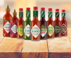
This is especially useful when the brand stretches into new products. Tabasco Sriracha (far left in image below) still feels clearly like Tabasco because it carries over the diamond label, colour and wordmark.
2. If you have a hero asset, let it lead
Some brands have one “hero asset” doing most of the work. When that is the case, don’t over-complicate things. Let the hero lead.
Mr Clean is a good example. The character alone accounts for 70% of the pack’s distinctiveness. It tells the brand team exactly what should be front and centre across the portfolio: Mr Clean himself.
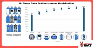
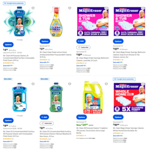
It means the brand can flex other elements, such as colour, to help shoppers navigate scents, benefits or formats (see below). The blue colour may be useful, but it is not the main recognition driver.
Too many brands do the opposite. They under-use the asset people actually remember, then obsess over secondary details that matter much less.
3. Test assets in context, not just in isolation
Testing distinctive assets in isolation can be useful. But it only tells part of the story.
In the real world, people don’t see a colour, logo or icon floating on a blank screen. They see assets in context: on a pack, on shelf, in an ad, on social or on a poster.
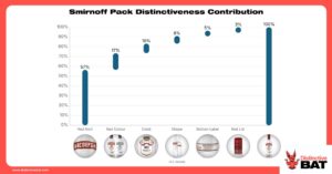
Smirnoff shows why this matters. The red logo lock-up performs well on its own. But when tested on the bottle, its role becomes much clearer, driving over 55% of distinctiveness. Add the role of the colour red, which contributes a further 17%, and the overall importance of the lock-up and red colour system rises to well over 70%.
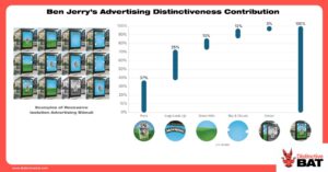
The same principle applies in advertising. For Ben & Jerry’s, the distinctive advertising system is built around a combination of assets: the pack, the logo lock-up and the brand’s colourful, playful visual world. The pack plays a particularly important role because it brings together several codes at once: colour, typography, flavour cues and the overall Ben & Jerry’s design style.
4. Use assets to build brand architecture and range navigation
The job of brand architecture is to balance two things: recognition and navigation. Shoppers should quickly see the brand, then easily find the right variant for them. And distinctive assets play a critical role in doing this
However, over time the role of DBAs can be diluted. Different SKUs, flavours, formats or sub-ranges are launched with slightly different design rules. Each decision may seem small in isolation. But the cumulative effect is a fragmented portfolio that weakens recognition.
Twinings is a good example shared by Distinctive BAT. Over time, a rapid succession of different flavours created a range that looked too disparate. The brand then carried out a major refresh, giving the logo lock-up more breathing room and introducing a consistent roundel device as a visual anchor across the portfolio.
This is not just about making the range look tidier. It is about making the brand easier to shop.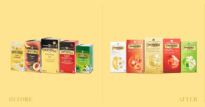
Image Source: Butterfly Cannon via Packaging Of The World
In conclusion, to build mental availability, identify your real drivers of distinctiveness, protect what matters most and flex the rest with discipline.
Notes on the method Distinctive BAT use
Distinctive BAT use a mix of Recessive Isolation and regression modelling to determine the contribution, and therefore importance, of individual assets (variables). “First, we break down the variables of interest and create multiple versions of an individual asset. Taking packaging as an example, we isolate specific elements and systematically test numerous pack variations by adding or removing certain features. We then apply these to our distinctiveness research, evaluating them against key metrics, and run Shapley regression modelling to isolate the exact importance weight of each asset.”
SOURCES
