
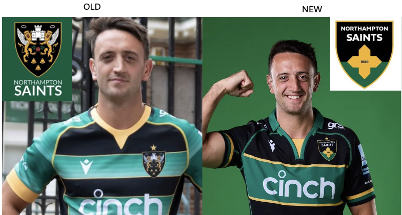
A controversial change to a leading English rugby club’s visual identity hit the new headlines last week. This shows how distinctive brand assets (DBAs) are a hot topic for all types of business, not just just classic consumer goods brands. Northampton Saints announced their new club crest (see below) with a fanfare, only to get a less than enthusiastic reaction. “New club crest branded ‘truly awful’ and ‘horrendous’, met with criticism from supporters,” reported the Daily Telegraph (1). The top comments on the brand’s Instagram post included, “It looks thrown together at the last minute, a mockery”, “Probably the worst badge I’ve ever seen” and “Such an unbelievable downgrade, what were they thinking?” (2).
In this post, I respond to the question from the CMO of another top rugby club that popped in my inbox this morning: “I am intrigued what you make of the new Northampton Saints crest and launch?” To do this, I draw on the learning from an earlier post on our research into DBAs here.
1. Treasure your brand assets
DBAs play a critical role in helping drive brand recognition. The most powerful assets act like a key to unlock brand meaning in an instant. They do this by tapping into ‘memory structure’ that allows people to react using immediate, intuitive thinking known as ‘system 1’. Truly distinctive brand assets take time and consistent support to create, with only 15% being rated as ‘gold’ in research by JKRxIPSOS we reported on here. This means that companies should treasure the brand assets they have managed to create.
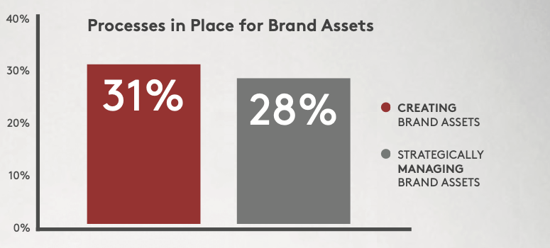
Ditching distinctive assets, as Northampton Saint have done, should be done only as a last resort. And any such change should be done as part of a proper process for creating and strategically managing DBAs, something a mere 28% of companies have, according to our research (see below). Given the mess Northampton seem to have got into, I do wonder if they have such a process in place. For example, the press release announcing the change (3) states that “the existing crest was only included on Saints’ playing kit since 1984”. Only since 1984? That’s four decades of investment in creating and amplifying the brand asset in question that has been thrown in the bin!
2. Measure your brand assets
A key part of strategically managing brand assets is to measure them properly before making any decision. We recommend using a quantitative study, such as the Iconic Asset Tracking (IcAT) we use on brandgym projects. Less than half of companies currently use this sort of quantitative study, with 19% using qualitative research and 34% using judgement alone. So, what did Northampton Saints do?
The club did carry out a pretty extensive project before ditching their distinctive brand asset. However, digging into this process flags up what I suggest are some flaws in methodology and how the results have been acted on.
- Reliance on qualitative research: the club’s CEO states in an update (4) that “our research identified that Saints’ current crest is difficult to recall.” However, reading the detailed report suggests that this is based mainly on qualitative research, not a quantitative study of the brand assets.
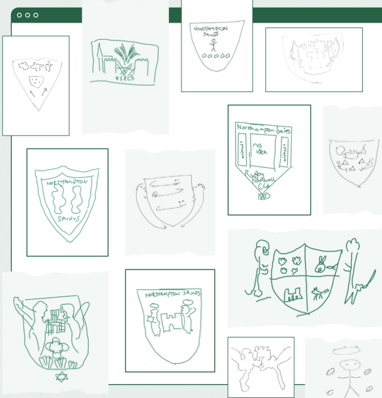
- Reaching the wrong conclusions: unprompted drawing exercises were carried out with supporters ((see below). This is a good exercise to get a qualitative idea of brand asset recall. However, the conclusion reached is, I suggest, flawed. “Even our own most dedicated supporter struggle to accurately recall our club crest,” states the report. But I’d argue that the unprompted recall of the crest is actually pretty good, based on 100s of projects done by the brandgym! The exercise shows several key elements are recalled, including the crest shape, the castle and the two liosn. The conclusion reached here suggests the project team don’t fully appreciate how hard it is to create distinctive memory structure.
- Treating consumers like marketing directors: the CEO stated that “A significant number of people told us within our survey that they would be open to this change (to evolve our crest).” However, asking supporters directly if they’d be open to a change of club crest is too direct a question. It requires abstract thinking, given people have no idea of what sort of change would be carried out. It treats consumers as if they were part of the marketing team!
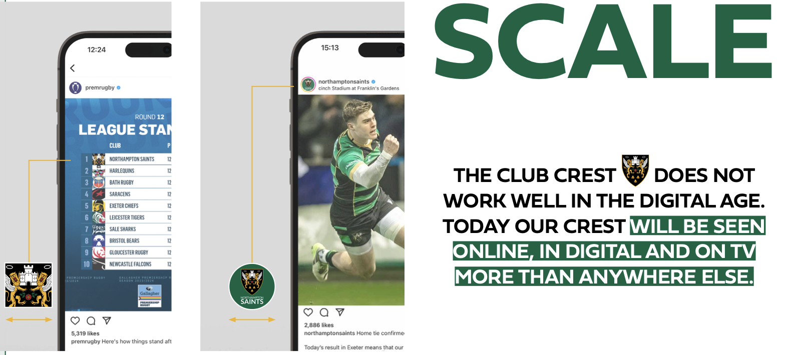
3. Avoid “dumbing down” for digital
“There is a need to make Club branding clearer and more legible in increasingly smaller spaces, but our existing version was almost impossible to scale,” is a challenge raised in relation to the club’s crest. This is a valid concern, given the need for a brand symbol that can work in digital media. However, the radical change made by the club runs the risk of “dumbing down” the brand asset into something overly simplistic. Multiple brands have fallen into this trap, losing out on brand asset recognition in the search for visual simplicity, as I posted on here.
4. Don’t demand system 2 thinking
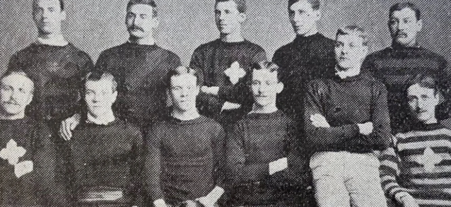
Another rationale for the radical change is that the current crest was “designed in the 1950s without any reference to the unique history of the Club itself, but rather as an adaptation of the Northampton coat of arms” (1). This drove the team to dig back into the club’s history to seek inspiration. The new brand asset is based on an emblem used on jerseys in the earliest team photo from 1884, when the club was called the St James Improvement Class (see below). “It’s very likely this is a link back to St James’ Church, with the emblem being a rough version of the St James Cross,” explains the club’s historian (4).
The problem with this approach is requiring current or potential supporters to think too hard, in order to understand the hidden meaning behind what looks at first like an overly-simplistic symbol based on a generic looking cross. “I would urge Saints supporters to digest this (research summary) in full to understand the journey we have been on already up to this point,” said the CEO in his update, for example. However, this is asking people to use rational, ‘system 2’ thinking which is hard, tiring and not something we want to do if at all possible.
In contrast, the original crest leverages ‘borrowed memory structure’ by adapting the Northampton coat of arms that may already be recognised, by local supporters at least. It also triggers meaning using system 1 thinking, with the lions and the castle suggesting pride, strength and solidity.
5. Favour fresh consistency
Northampton Saints set out with the right ambition, based on a belief that I share: “the biggest sports teams boast visual identities that are immediately recognisable and highly memorable.” However, I suggest the club has missed a trick by opting for revolution, as opposed to evolution based on the principle of ‘fresh consistency’. This latter approach requires a team to keep some key elements consistent, to build on existing memory structure, whilst also bringing freshness to stay up to date.
Our simple KULA framework would be useful here, if the club decided to re-visit the decision to ditch their distinctive brand asset:
- KEEP: key elements that drive recognition, which could include the castle and the lions, in addition to the shape of the symbol (which has been kept)
- UDDATE: these key elements could have been simplified and freshened up to make them more impactful
- LOSE: some extraneous detail could have been cut from the crest, again to increase impact
- ADD: a good idea was to include black, green and gold colours, seen by 75% of supporters as “the most important part of the Club’s overall identity” (3). The addition of the club name in the crest also helps address low brand awareness (23% of rugby fans, around half the level of the team I follow, Harlequins)
In conclusion, the Northampton Saints case shows the risk of ditching distinctive brand assets, rather than carefully evolving them using the principle of fresh consistency.
The club were hopefully prepared for the brand backlash. “We completely understand that change may be uncomfortable for some supporters who have had a long and powerful emotional relationship with our previous crest,” they state in their press release. Time will tell if they weather the storm and invest in building meaning into the new club crest or if they decide the KULA approach would be a better way to “look forward to secure the continued relevance, appeal and sustainability of the Club.”
SOURCES
(1) News report on Northampton Saints new club crest (subscription needed)
(2) Social media reaction from supporters
(3) Press release from Northampton Saints announcing the change