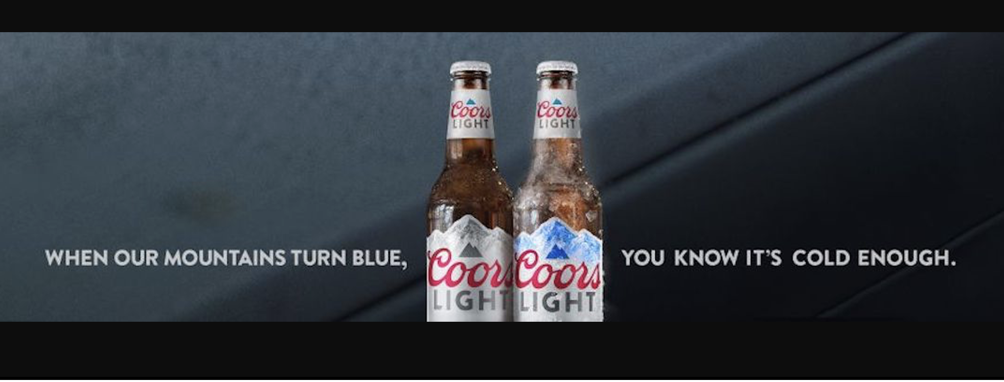
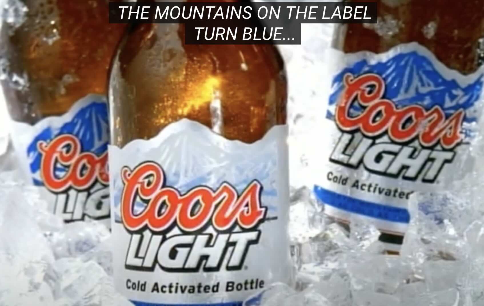
I recently read an article (1) about the Coors Light’s “blue mountain” colour changing cans. Mountains on the can turn blue when the beer reaches an optimal cold temperature, thanks to the use of thermochromic ink. The cans were launched in the US in 2009, helping the brand overtake Budweiser to become the number 2 beer brand in the market (2). And after 15 years the distinctive brand asset is still going strong. In this post we explore learnings from the case on how to create and amplify a distinctive brand asset.
1. Cues a relevant benefit
The rocky mountain visual works at the most basic level to help Coors Light stand out and get recognised. But like all great brand assets it also work as “a key” to quickly and easily unlock brand meaning. The first way it does this is by “cueing” a relevant product benefit. Consumers have a strong preference for cold beer, associating it with optimal refreshment. Research showed that many beer drinkers had negative experiences with warm beer. The color-changing cans directly addressed this issue by providing a clear, visual indicator that reassured drinkers their Coors Light was cold and ready to enjoy. This innovation significantly enhanced the drinking experience, fostering greater consumer satisfaction and loyalty. “The blue mountains are a manifestation of our commitment to cold,” commented Chris Steele, senior marketing director for Coors Light (1).
2. Brings the brand world to Life
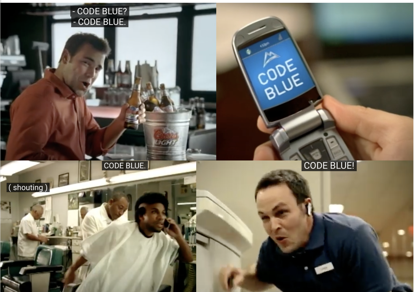
The blue mountains on the cans also bring to life the Coors Light brand world and the association with the Rocky Mountains. The color-changing technology reinforces Coors Light’s brand promise of delivering a beer as cold and refreshing as the Rockies, strengthening its positioning and driving distinctiveness versus competitors. The pack innovation was used as the hero in brand communication, with the idea of a drinker calling “a code blue” to alert friends that the Coors Light beers were now ice cold and ready to be enjoyed.
3. Expand to multiple Markets
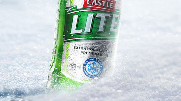
The colour changing cans were initially launched in the UK, before expanding to Canada in 2008 and the U.S. in 2009. This expansion created a unified, recognizable symbol of cold refreshment across different regions. It’s a great example of creating a brand asset that is scaleable (can grow and develop over time) and replicable (can be expanded across multiple markets). Interestingly, the extra cold refreshment positioning and colour changing cold activated packaging were adopted and adapted with great success by the Castle Lite brand in South Africa, thanks to a link with Coor’s Light (Castle Lite’s brand owner AB InBev (formerly SAB Miller) used to own the US distribution rights for Coors Light). In the case of Castle Lite, thermochromic ink was used to design a “snow Castle”, leveraging the brand’s logo as a device.
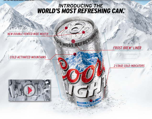
4. Create fresh consistency
Over the past 15 years, Coors Light has consistently utilized the color-changing cans, making the blue mountains an enduring brand asset. This brand asset has also evolved with additional features like two-stage cold indicators (“Cold” and “Super Cold”) and an updated graphic designs.
In conclusion, the Coors Light colour changing cans are great example of how to create and amplify consistently a brand asset that drives distinctiveness and also unlocks relevant benefits and brand meaning.
SOURCES