
New logo design by Santander: the good, the bad and the questionable
We start our brandgym Mastering Brand Growth program and our brand strategy projects talking out how branding is about the whole business, not just logo design. So, I read about the updating of Santander’s logo design today with mixed emotions (1). On the one hand, the company has remembered and refreshed what made the brand famous, avoiding the mistake of ditching distinctive assets that I posted about last week. But I did sigh with despair at how the article gives the impression that branding is mainly about a company’s logo design.
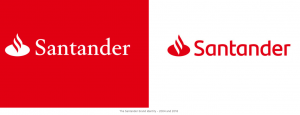
Below, I look at the good, the bad and the questionable about Santander’s logo design revamp (below right).
1.The GOOD: refreshing your visual assets
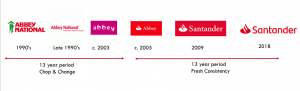
Santander’s UK business was created via the takeover of the Abbey National brand in 2004. In the 13 years prior to the takeover, Abbey National chopped and change its identity, most notably in 2003, when a multi-coloured makeover replaced the long-used red with a rainbow of colours and the rather exaggerated promise to ‘Turn banking on its head’. The relaunch cost a reported £11million, a big stash of cash back in 2003 (2).
Credit to Santander for much better management of the visual identity in the last 13 years:
- Step 1 – 2005: keep the Abbey name but introduce the Santander visual identity with the flame and re-introduce the red colour of Abbey National
- Step 2 – 2009: five years later, the Abbey name was replaced with Santander. Enough time had been left to create distinctive memory structure for the visual identity. Many customers may not have even noticed the change.
- Step 3 – 2018: nine years on and the visual identity is refreshed
And what about this latest change? The red colour and the flame have been retained. “The flame has helped make Santander one of the world’s most recognisable brands,” as Keith rightly points out. And if you look carefully, the typeface has been changed from ‘serif’ to ‘sans serif’ (smoothing off the twiddly bits on each letter), which does make it more streamlined. It also looks bolder, which should make it more visible.
It is also good to read that some sort of testing has been done. According to the article visibility in the key mobile channel has been boosted by over 20%.
2.The BAD: suggesting a brand is just a logo
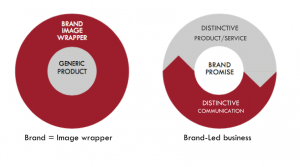
We have a long-standing battle to convince senior managers, especially those in service businesses, that a brand is more than just an ‘image wrapper’ made of a logo and communication.
We try to get them to think about ‘Brand-led business’: driving the brand idea through the whole customer experience from end to end.
So I cried into my Cornflakes this morning when I read the explanation of Santander’s new visual identity.
The headline announced, “Why we’ve changed OUR BRAND.” The article goes on to describe how Santander decided to “Look at OUR BRAND and ask how can we renew it for the next chapter?”
Good question.
But what was the answer ?
“We’ve kept the essence of OUR LOGO, but re-thought every aspect of it.”
Yup. The big brand idea is to tweak the logo.
In defence of Santander’s CMO Keith Moor, he does eventually talk about the stuff that really matters.“Of course, a brand is much more than a logo,” he rightly explains. “Most importantly, it’s about our customer experience.”
I just wish he’d led with this point, rather than ending with it.
3.The QUESTION: reversing red and white?
“We’re keeping the red, but will increase our use of white backgrounds, helping us to stand out more in digital channels,” explains the article.
I do wonder how smart this move is.
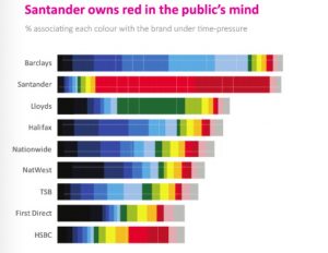
Research by agency System 1 indicates that red is a key distinctive asset for Santander, being strongly linked to the brand. This is based on testing where consumers are put under time pressure and forced to use system 1 thinking (below).
This data suggests it will be important to continue featuring red prominently in the brand’s marketing, and not go too white, to ensure strong recognition is maintained.
4.The BAD: over-selling a logo change
Marketers have a bad habit of over-selling logo changes. And the Santander article does make this mistake, although not as bad as previous logo change announcements I posted on, such as Yahoo and Uber.
“We spoke to thousands of employees, customers and members of the public across all of the Santander Group’s countries,” enthuses the article. “The work on the new brand (aghhh) has been a collaboration between in-house teams and leading global brand consultancy Interbrand.”
Now, if I was a Santander employee, I would wonder how much cash is being spent on agency fees and all the changes, in branch and online, to basically do 2 things: i. reverse the colours to be red out of white, and ii. tweak the typeface.
The risk with hard-selling small, cosmetic changes is that instead of creating brand engagement it comes across as brand bollocks. As James Hankins of MGOMD commented, “Personally it looks clearer, great. All the bumpf that comes with it though zzzzzzzzzzz.”
In conclusion, hats off Santander for 13 years of fresh consistency. Coupled with the core product innovation of the 123 account that I posted on here, this approach has created significant growth for the business during turbulent times for financial services.
I just wish the announcement of the fine-tuned logo had been just that, and not an over-trumpeted claim to be refreshing ‘the brand’.
You can see here more examples of how to ensure your brand drives the whole business, not just logo design.
And if you want to explore in more depth how to harness the brand to drive the whole business, our brandgym Mastering Brand Growth program might be up your street. If you’d like more info on the program, simply pop your name and email in the form below (we’ll also send you the weekly brandgym blog email and brandgym Academy news, but you can opt out at any time).
Sources:
1. https://www.linkedin.com/pulse/why-weve-changed-our-brand-sticking-name-flame-keith-moor/
2. http://news.bbc.co.uk/1/hi/programmes/working_lunch/3134846.stm