
Dorset Cereals: another ‘design u-turn’?
At breakfast this morning I opened a new packet of Dorset Cereals and admired the simple but beautiful pack design. But then I remembered a blog post I wrote a couple of years ago here about what I thought was a dodgy re-design that that made the packs more cluttered and less impactful. Well, it seems that Dorset agreed. The ‘old’ packs have indeed been re-introduced. This seems to be another example of a brand ditching design properties, only to go back to them later, following the earlier post on Keep Britain Tidy here.
1. What made Dorset famous?
 First, a quick rewind on the Dorset brand. Back in 2005, private equity firm Langholm Capital bought a sleepy, worthy but unattractive looking breakfast cereal, and added a large dose of magic dust. The brand was transformed in terms of product, positioning and especially packaging, to become a highly desireable and distinctive brand. Sales and brand equity grew explosively through the latter part of the 2000’s and into the 2010’s.
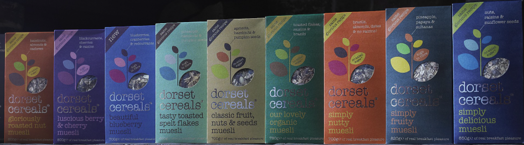
The power of the pack design was its ‘brilliant simplicity’. This created ‘brand blocking’ on shelf and excellent stand-out (see below). Colours helped navigation, which is how people often shop (“I like the blue one”, rather than “I like the Tasty Toasted Spelt Flakes one”). The window in the shape of a leaf was a stroke of genius to communicate naturalness, both in the shape and the way it made the product visible.
2. Forgetting what made Dorset famous?
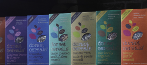
Fast forward to 2015, and the brand trumpeted a new re-design. The colours stayed the same, along with a visible window. But two different sub-ranges, Simply and Ultimate, now each had a different shaped window. And in place of the simple, uncluttered design we had something more intricate and fussy that looked a bit like country-inspired wallpaper.
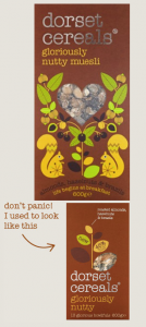
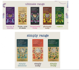 At the time I said, “I can’t help feeling that the new design is trying to do too much. Rather than being simple, self-confident and iconic, the pack is now trying to tell a different story about each product. This could make the brand less distinctive, not more so, especially at point of sale where the job of design is mainly to get the brand noticed amongst the clutter.” And warning bells really started ringing when I saw how much the website was talking about the design changes. As you hovered over a design with your mouse, the old pack re-appeared, accompanied by text that said, “Don’t panic! I used to look like this“. Uh oh. When a brand works this hard to “educate” consumers about a pack change, there is reason to panic . The risk is making it harder for people to find the brand in the few seconds they spend at shelf.
3. Back to the future
Wind ahead to 2017 and, hey presto, we have the old pack designs back in all their glory with key properties restored:
- Single flower-shaped window
- Bold, bright colours
- Uncluttered design
- Single design for Simply and Ultimate sub-ranges
4. Treasure and measure your assets
Brand properties, like the Dorset design, are valuable assets that deserve to be treasured. And yet decisions to ditch them are most often taken on judgement, usually linked to a change in organisation, such as a new Marketing Director or a take-over. Only 24% of brand property changes are based on quantitative data, according to our brandgym research. Well, guess what happened in mid-2014, months before the design change? Dorset was bought for £50million by ABF. My guess is that a new team had something to do with the new design, keen to ‘make their mark’ on their newly purchased brand.
An ‘Iconic Asset Tracker’ (IcAT) study would have allowed ABF to measure the Dorset brand properties, such as the leaf-shaped window, and help them make a data-based decision. Importantly, this approach uses an ‘implicit thinking’ approach, where people react to brand properties in less than a second, highlighting the iconic assets that are truly embedded in memory structure.
In conclusion, the Dorset design U-turn shows the risk of ditching brand properties that have been used over many years to create valuable memory structure. In Dorset’s case, the company spent a load of time, money and effort to change the design… only to then have the hassle of reversing the change two years later. Our advice? If you treasure your brand assets, then measure them. And make sure you get the right balance of freshness and consistency, especially with pack design.